Cal Poly · UX Lead · Sept 2023 to Dec 2025
a health portal students
actually wanted to use
How I revamped and redesigned Cal Poly Health and Wellbeing source of truth website as a solo designer, in a 2011 platform.
tldr; the outcomes
690%
increase in engaged sessions (13,003 to 102,652) in year one
60%
decrease in drop-off rates across redesigned pages
100%
of designed work shipped over 2+ years of iteration
The problem
Students didn't trust the website. So they stopped using it entirely.
When I joined Campus Health and Wellbeing in September 2023, the numbers were damning: only 13,003 engaged sessions across a campus of 23,000 students. That's 56% reach, with high drop-off at nearly every entry point.
But the numbers weren't the worst part. Students were physically walking to the health center to ask staff questions they could have answered online. Appointment hours. Resource locations. Basic FAQs. They would rather make the trip than touch the website. That is not a discoverability problem. That is a trust problem.
"Students were asking staff in person rather than use the website, even for basic things like hours and appointment booking."
Staff interviews, September 2023
UX failures
No visual hierarchy, walls of dense text
Outdated, inconsistent visual design
Critical info buried 3 or more clicks deep
WCAG accessibility failures throughout
No mobile consideration whatsoever
Organizational constraints
No design system, no brand guidelines
Staff historically preferred text-heavy pages
Running on Drupal 7, released in 2011
First UX hire in department history
Slow institutional approval processes
The constraint
Drupal 7 gave me almost nothing. So I built a workaround system from scratch.
Drupal 7 had no font control, no color customization, no responsive layouts, and no modern component library. Most designers would have flagged this as a blocker and asked for a different tool. I had no other tool. So I figured out what Drupal could do and designed entirely around its constraints.
The cost
PNGs don't reflow responsively. Mobile users would see a desktop-optimized experience.
Why I accepted it
Analytics showed 75% desktop usage. A Drupal upgrade was planned in 3–4 years. The trust problem was urgent now.
SEO risk
Image-based text is invisible to search engines — a real risk for a health resource students need to find.
The fix
Body content stayed as native Drupal text for SEO. Every PNG received comprehensive alt text. Non-negotiable.
The conflict
Staff wanted more text. Data said that was exactly why students left.
Staff members consistently pushed for pages dense with written content because they thought more information meant more clarity. From the data, it meant more abandonment.
Staff position
More text means more clarity. Students need to understand their health options fully before acting.
What data showed
Long text blocks were the primary drop-off driver on every page. Students left before reading it.
My first instinct
Push back with the data in each review meeting when text requests came up.
What actually worked
Lead with data proactively before anyone asked. Shifted the dynamic from designer-vs-staff to shared problem-solving.
The solution wasn't less info
Cutting content entirely wasn't the answer as a lot of it was genuinely important.
Better architecture
Progressive disclosure: short scannable headers, detail pages linked from CTAs, layered content for those who wanted depth.
Research
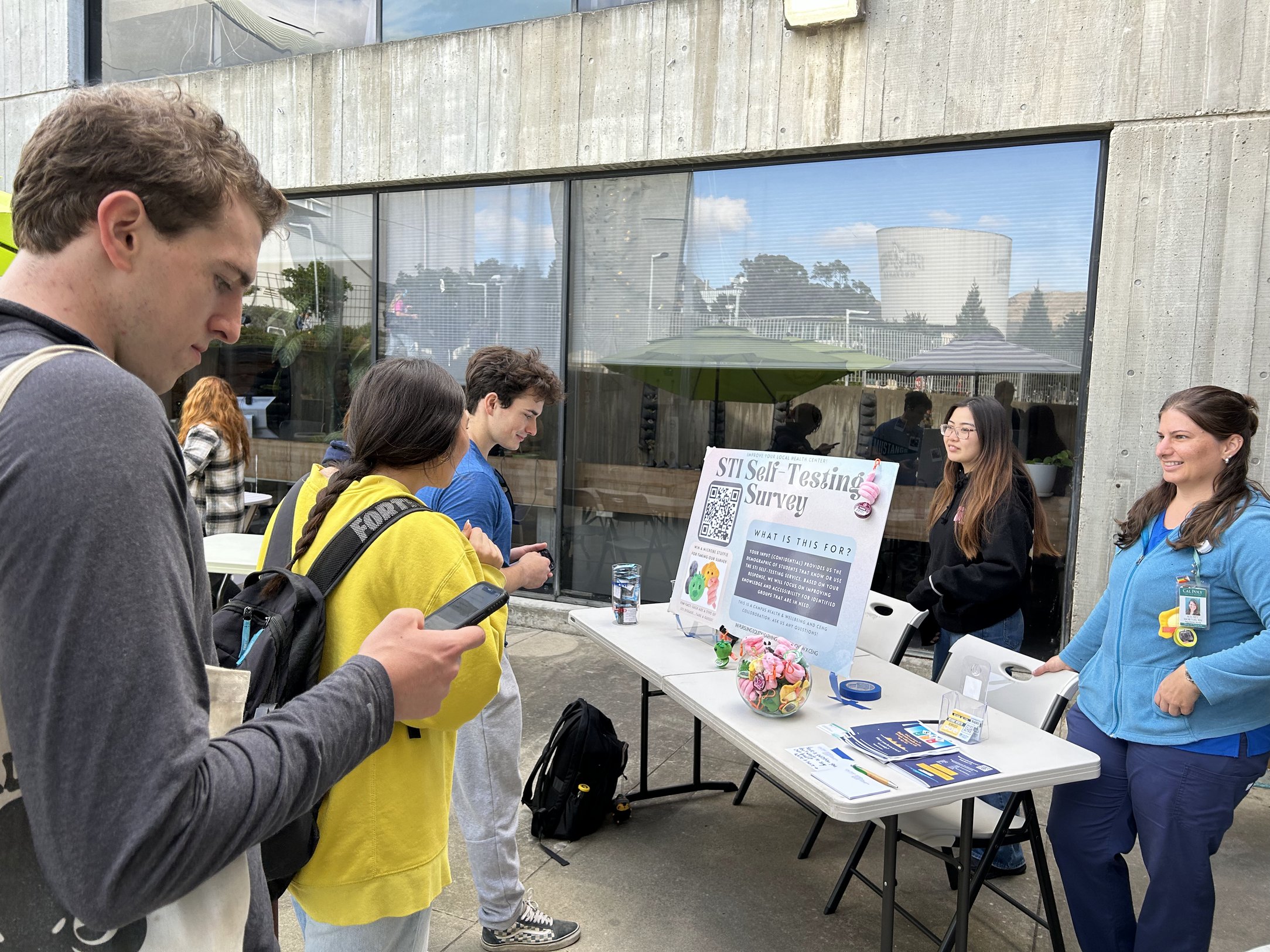
No formal research budget. Five channels I built myself.
Cal Poly had institutional focus groups, but they recycled the same participants and ran on slow timelines. I built a parallel research practice from scratch, running five channels simultaneously to stay close to real student behavior without waiting months for formal results.
Channels I used
Social listening on Reddit and Facebook groups
Staff interviews to capture recurring complaints
Guerrilla research via student assistants
Google Analytics deep dives on drop-off and scroll
Survey partnership with student health org for STI campaign
What I found
Students could not find appointment booking without help
Health content felt clinical, cold, and unwelcoming
STI resources carried stigma-reinforcing framing
75% desktop usage validated mobile tradeoff decision
Most drop-off happened on text-heavy informational pages
Design
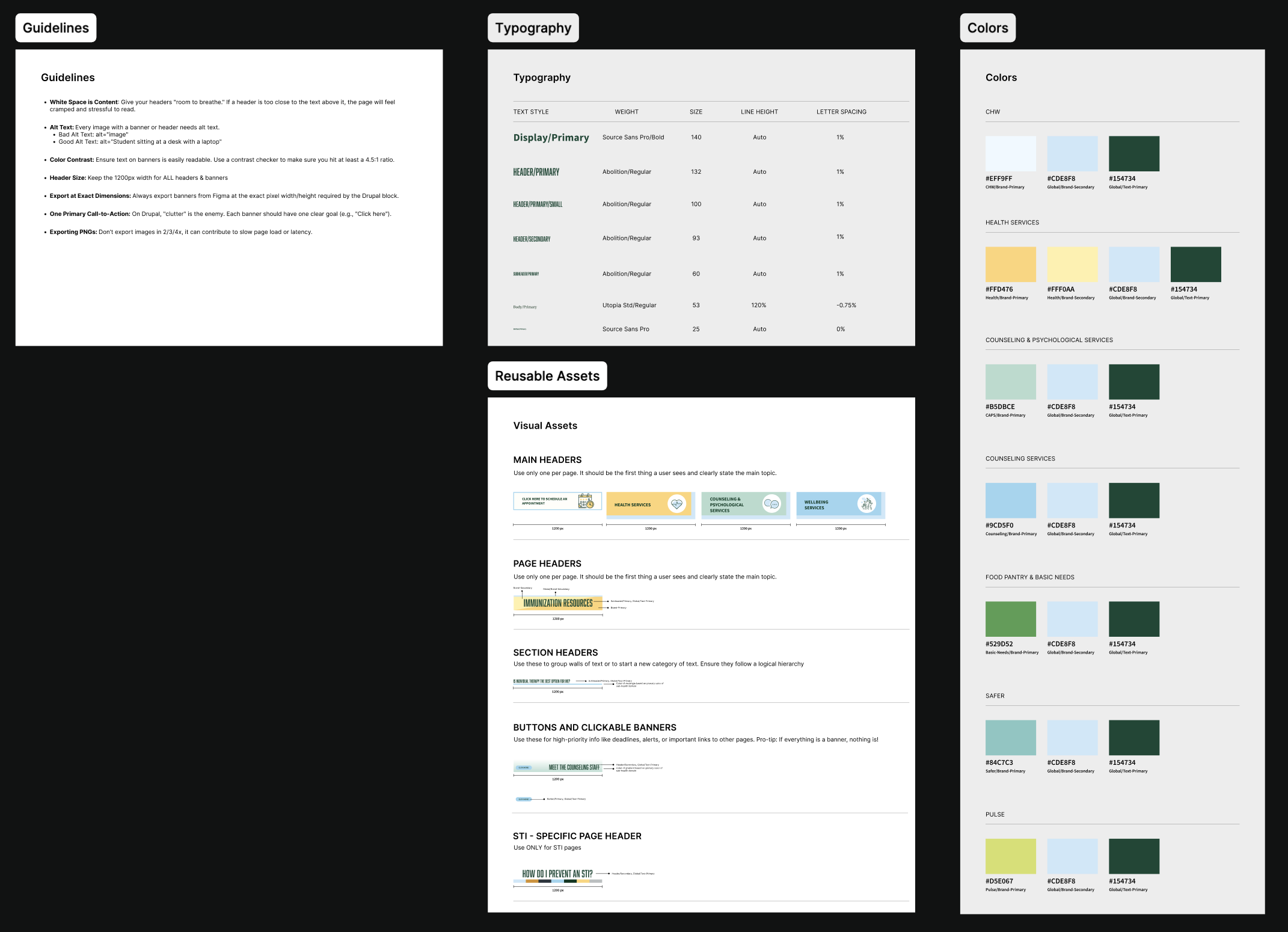
System first. Pages second.
The first two months were not about designing anything visible. They were about understanding exactly what Drupal could and could not do, auditing existing brand assets, and building the Figma component library that every subsequent page would be built from.
The component library included: header styles at three hierarchy levels, button and CTA treatments, color palette aligned to CHW brand guidelines, accessibility checklists, and detailed documentation on what was and was not possible to implement in Drupal. This was the design system that the department had never had and now would keep long after I left.
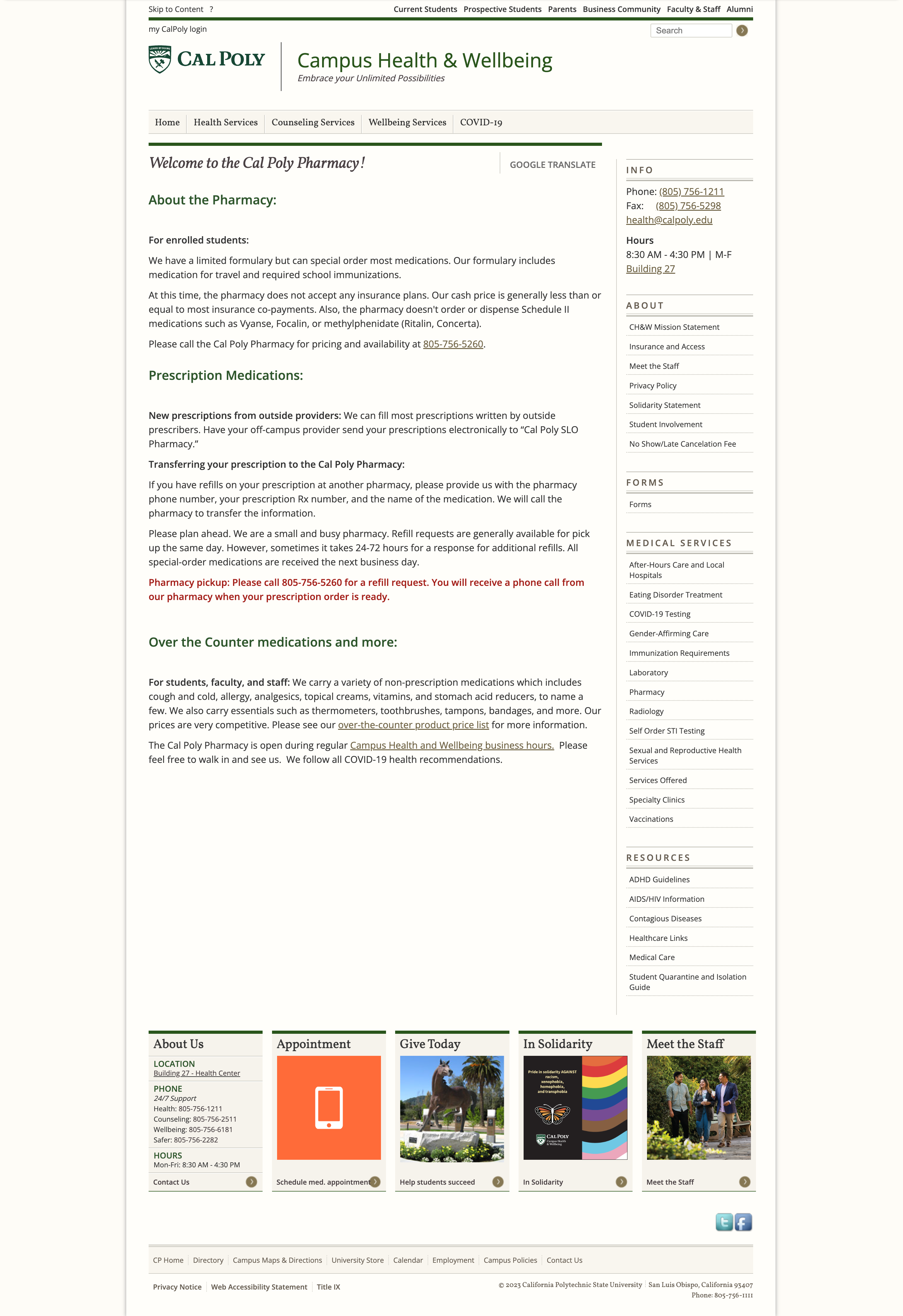
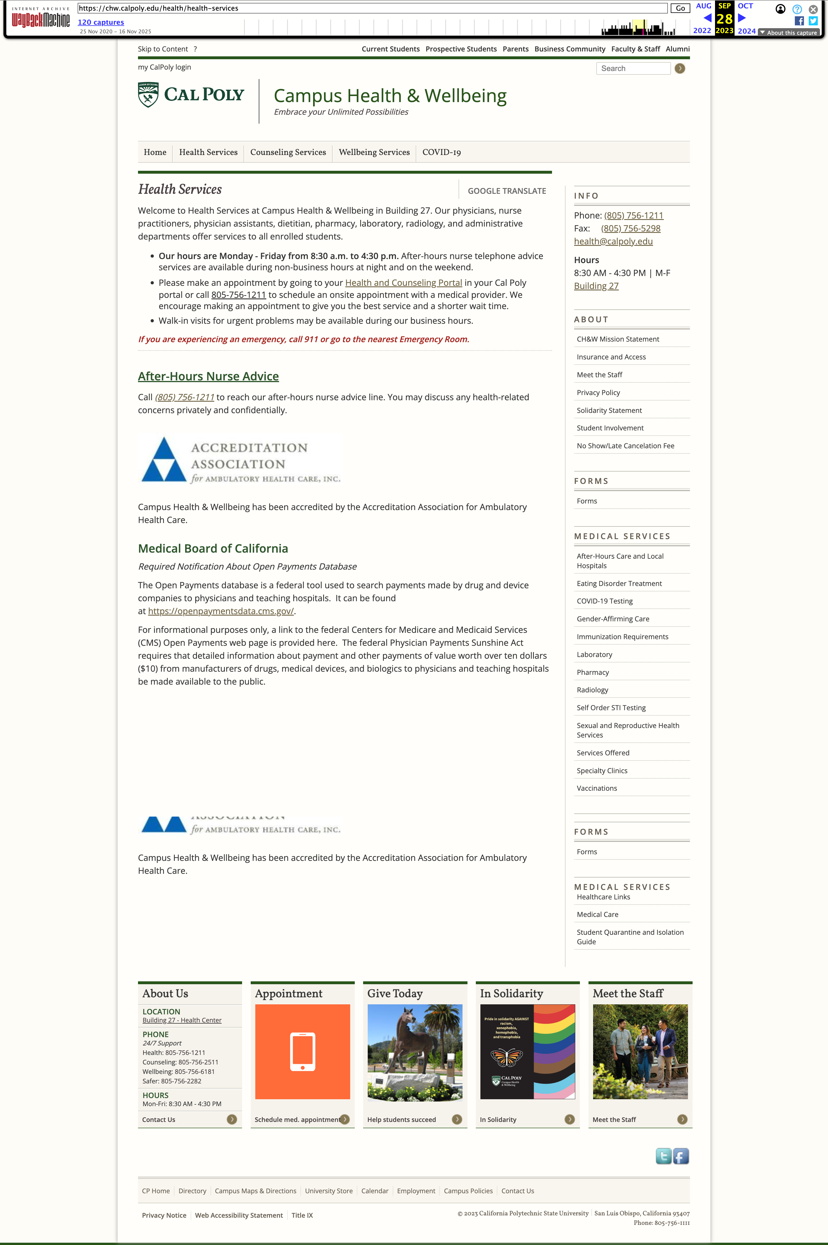 Before
Original page — pre-redesign
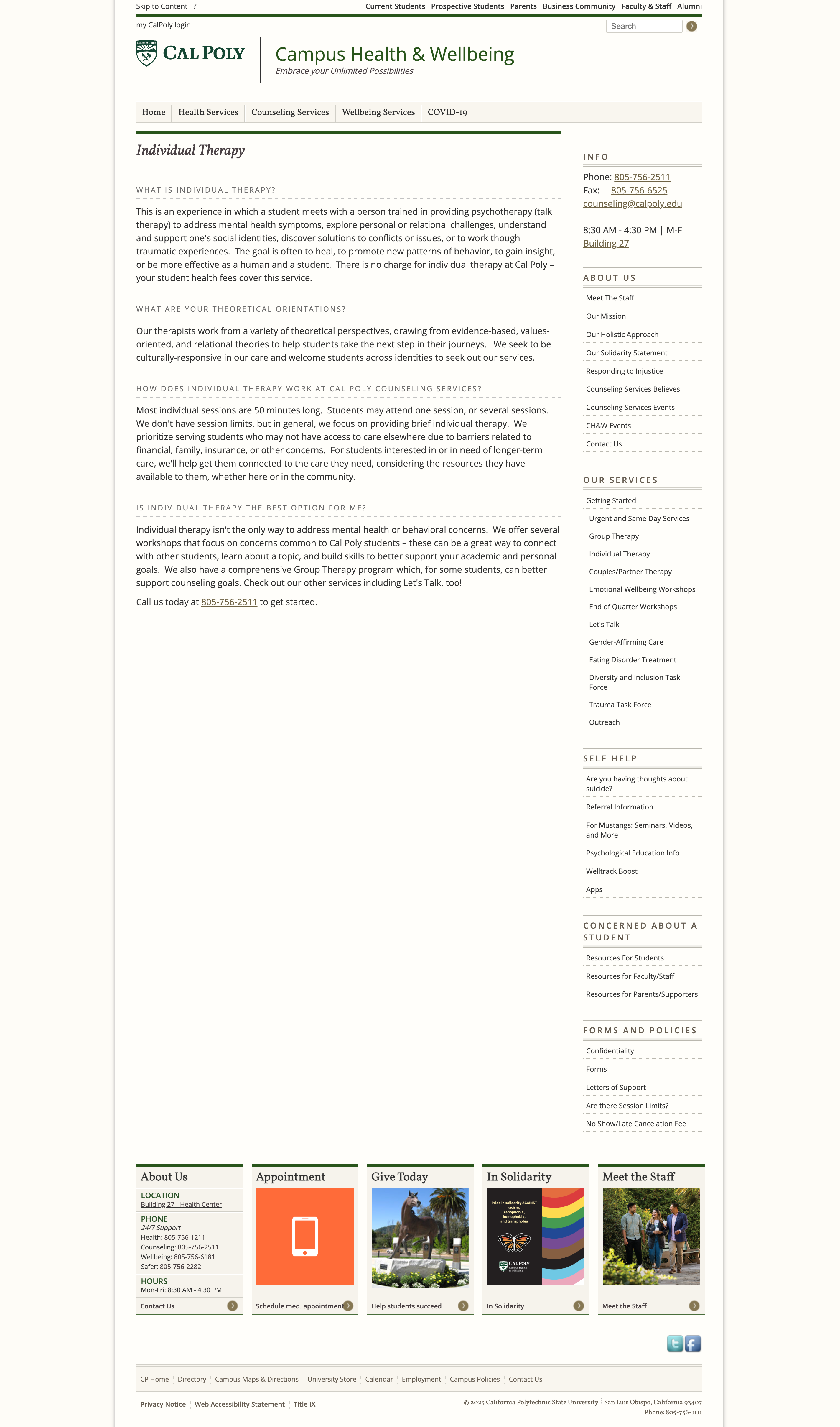
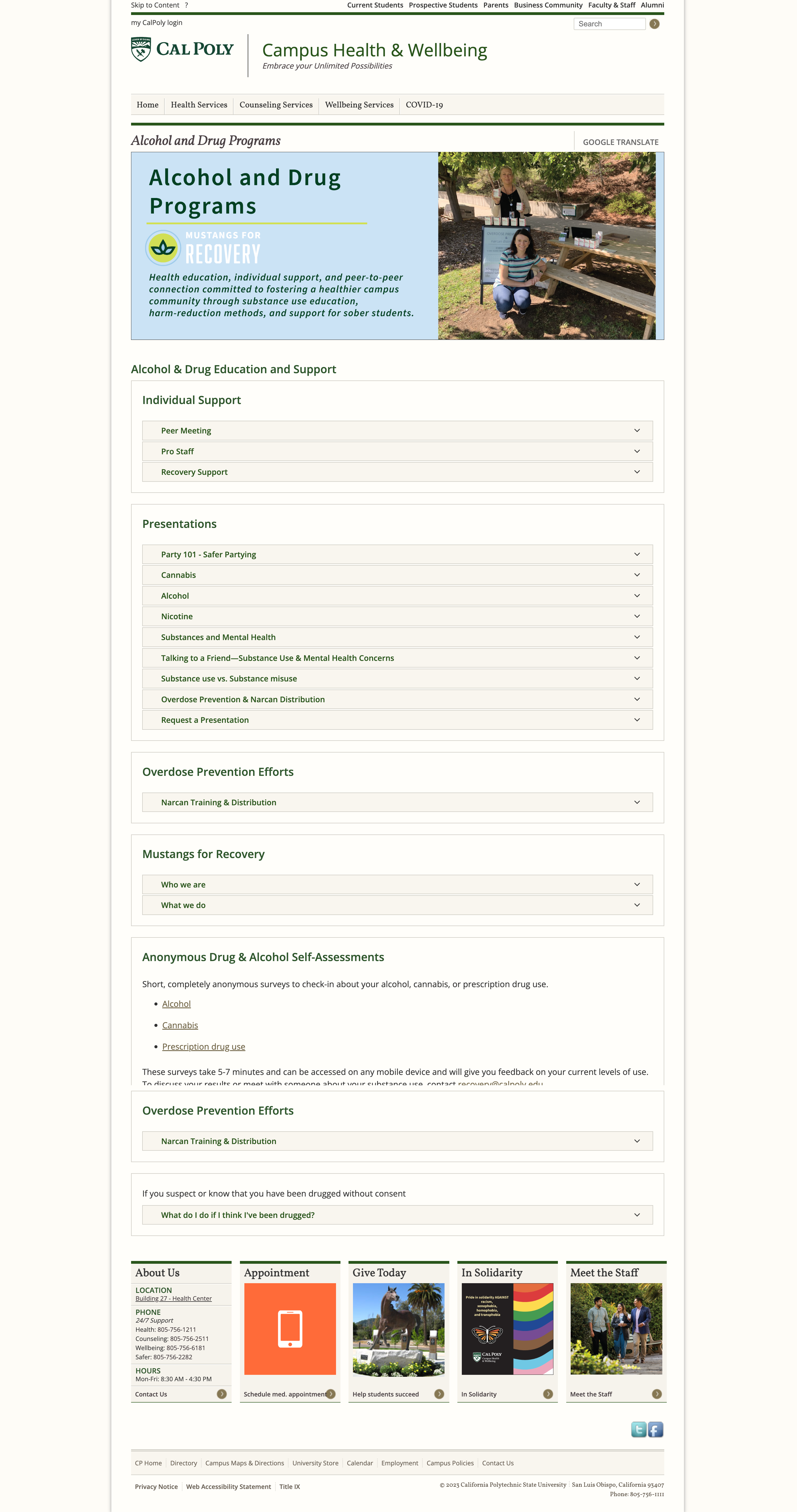
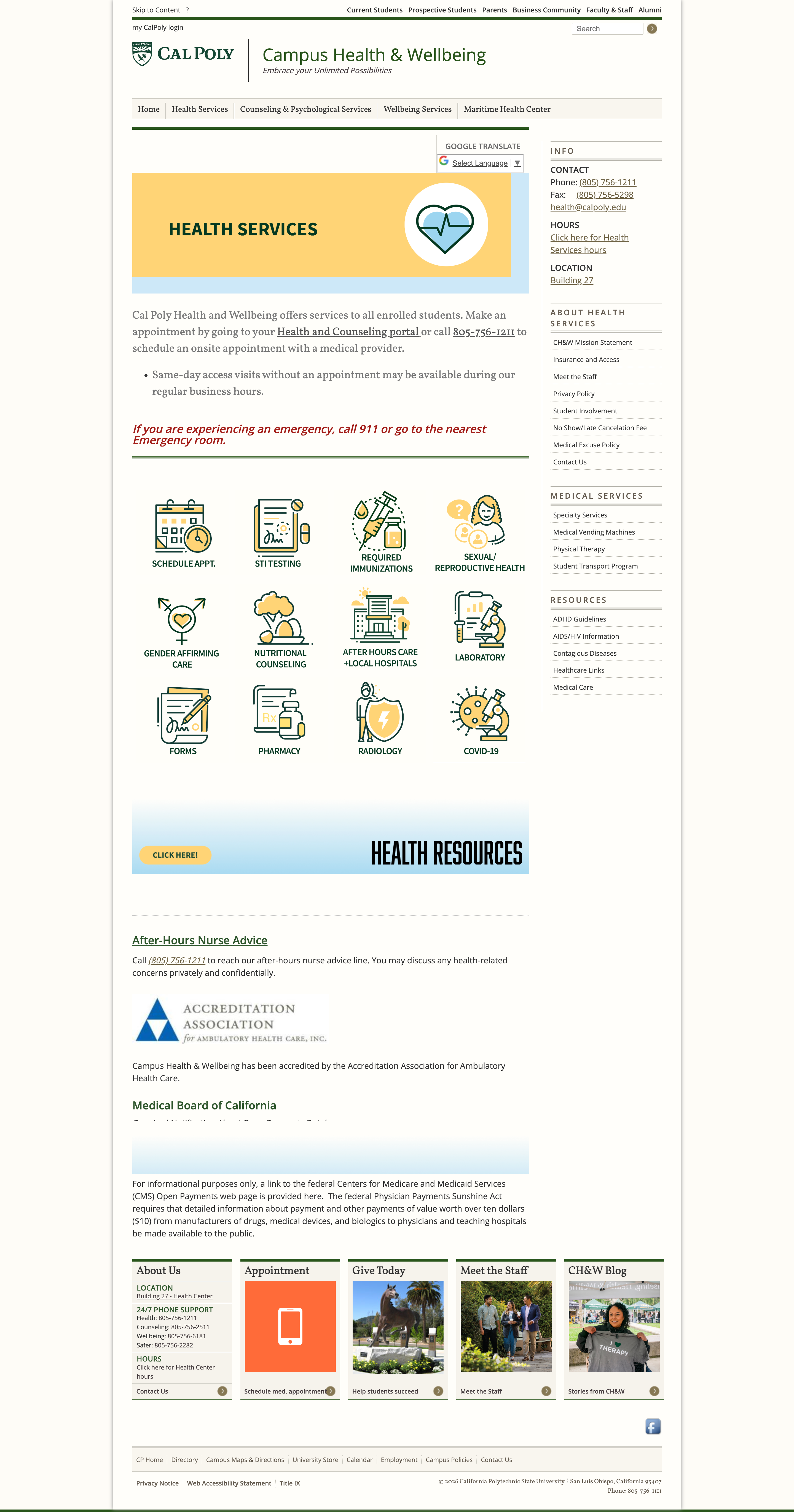 After
After
What the research showed
Clinical language and warning-style framing caused students to disengage before reading the content.
The design response
Make it feel like information, not a warning. Warmer visuals, normalized language, student-reviewed copy at every stage.
Outcome
From 56% reach to nearly the entire campus.
In the first full year after the redesign, engaged sessions grew from 13,003 to 102,652. That is a 690% increase. Drop-off rates fell 60% across redesigned pages. For the first time, students were mentioning the portal as something genuinely useful, not something to avoid.
Beyond the metrics: I established the UX function at Cal Poly Campus Health entirely from scratch. I built the design system the department will use long after I leave. And I shipped 100% of everything I designed over two years. Every single page went live.
Year 1 · 2022–23
13K
engaged sessions
baseline
Year 2 · 2023–24
102K
engaged sessions
↑ 690%
Year 3 · 2024–25
200K+
engaged sessions
↑ continued growth
Learnings
Two years of shipping in difficult conditions taught me things no internship could.
01
Constraints are a design material, not a blocker.
Drupal 7 could have been the reason nothing improved. Instead it pushed me to think more carefully about what design control actually means and where it matters most. The PNG workaround was not a compromise. It was a considered decision with a clear rationale. I learned to document those rationales so teams understand the thinking, not just the output.
02
Advocacy without evidence is just opinion.
Every time I pushed back on a staff request for more text, I needed data to back it. Over time I stopped waiting for the pushback and started leading with the data proactively. That shift changed the dynamic from designer defending choices to team solving a shared problem together.
03
Trust is the actual product.
The portal did not need to be beautiful. It needed to make students feel like their health information was in reliable, competent hands. That is a completely different design brief than "improve the UI." Running everything through that filter changed every decision I made, and I have carried it into every project since.
.png)